Sunday, January 1, 2012

The Stickuation Room


If you were anything like me as a kid, you loved stickers. Maybe you had a sticker book where you would place them all carefully, as the precious items they are to children. Now, what would you do if you had unlimited stickers at your disposal? You heard me. Unlimited. Stickers. That was the idea behind Yayoi Kusama's exhibit at the Gallery of Modern Art in Brisbane. After painting a large, domestic space pure white, she armed the museum's little ones with stickers and let them have at it. The results are incredible, and make me wish I were a kid again. Via This is Collosal.••••

Tuesday, December 13, 2011

a Plastic Perfect Wedding

I love looking through photographer's wedding portfolios, but no matter how unique or quirky the couple, you can pretty much guarantee that each album will contain just a few of the same staple shots (the shoes, always the shoes). I think that's why I got such a kick out of Barbie and Ken's wedding album. It's well shot, but also has a sense of humor about industry standards. Click here to poke through all of the shots taken on this special day for B&K. ••••


Thursday, December 1, 2011

#christmaswishlist

Brand Memory is a great idea, and a perfect gift for the designer in your life this holiday season. Hint, hint. ••••

Wednesday, November 16, 2011

But I don't like Place Kittens...


No worries! Bacon Mockup is here for all your design and development needs.


-Created by my coworker, Pete Nelson ••••

Wednesday, November 2, 2011

Hey Girl

Hey girl, thank you for creating this tumbler...the combination of Ryan and Typography is awesome.


Sunday, October 23, 2011

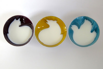
Bowled Over

I'm a sucker for a well-designed ceramic piece, and this is one clever and playful idea—these bowls fill up with your morning cereal to reveal a hidden animal in their design. Kudos to Geraldine de Beco for a stellar idea. ••••


Monday, October 17, 2011

Once Upon a Minimalist


Minimalist. check. Modern. check. I'd like each of these children's story posters framed in my house one day.••••

Tuesday, October 11, 2011

Practice Makes Perfect


Think you can kern a mean sentence? Practice here.••••

Monday, October 10, 2011

Better than Splash Mountain


Just in time for Halloween, a Flickr stream of amazing mid-scare shots from a Canadian Haunted house. Via The Orlando Egotist ••••

All Tumblrs are the same except this one.


Cubicle Refugee focuses on color instead of subject. Grabbed a lot of inspiration from here today. ••••

The Hue Test

This made me blind because I stared at it for so long. I love a challenge. Read this first in case you don't know what hue is. Cant. Stop. Seeing. Spots. Worth it? I'm not sure, I only got a 40. ••••

Wednesday, August 17, 2011

In Living Color


I will never cease to amazed away by trompe l'oeil sidewalk chalk, or Baroque ceilings, which trick you into seeing depth where there is none. But here is a twist I like— painter/photographer Alexa Meade's subjects live and breathe, but you might not realize this at first blush. After some impressive brush work, her models easily pass for two-dimensional in a photograph. You might think there is some Photoshop involved in creating these images, but think again!

Check out Slate's slideshow for more of Meade's work. ••••