Showing posts with label designer. Show all posts
Showing posts with label designer. Show all posts
Friday, January 14, 2011


Monday, November 1, 2010
Facts I know about designer Nick Feltron:

In 2005, Nick rocked out to 16,862 songs on iTunes. He killed 4 plants during 2006. In 2007, he ran 190.5 miles, but only watched one sporting event—the Superbowl. In 2008, Nick drank 408 beers, 9% if which were Sierra Nevada. And last year, he estimates his focused to distracted ration was 9:2.
 Nick sounds like a cool guy, but unfortunately we've never actually met! I know all this information because he chronicles it meticulously in the Feltron Annual Reports. Since 2005, Nick has produced these letterpressed reports yearly, and they track every possible detail you might want to know about his life—and I do mean every possible detail. Spend some time with them and you'll see. From maps that follow his every movement across the globe, to the milligrams of caffeine he consumea per year, it is all there.
Nick's obsessive tracking of data has help, and herein lies the double beauty of the Feltron Annual Reports. Nick, along with designer Ryan Case, is co-creator of the website Daytum.com. Daytum is a website for personal data tracking. Aha! To my eyes, these reports are the best advertisement for their product imaginable— well-designed, wryly funny, and unbelievably, unbelievably thorough. ••••
Tuesday, April 27, 2010


Tuesday, April 20, 2010
Erin Hanson

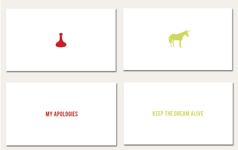
 Simple, good, funny design. Erin Hanson does that. Her photography is pretty exceptional as well. The "Reminders" series (below) is especially good, and something I should do in my apartment because of my forgetful nature. Check out her work here. Buy some of her stuff here. Via Notcot. ••••

Friday, February 5, 2010
Josef Albers
This post goes out to my Crew Members (and any other CFA graduates who read our blog): Josef Albers Album Covers! See them all here. ••••
Monday, September 7, 2009
Tamar Cohen
 I saw Steven Heller's write up on Tamar Cohen about a month ago, and saw she was exhibiting in Provincetown at the Gallery Ehva. I went to check it out and was really impressed by her work and her exhibition wall setup. As you can see from these snapshots, she chose to integrate the wall space by having the patterns from some pieces spill over onto the wall and floor. I love the work on her site, but I really appreciated the fact that she took it one step further with the exhibition. Check out her work here. ••••


Thursday, July 16, 2009
Most Agreeable, Indeed!

I love Jane Austen, and I LOVE these book covers. What lovely and appropriate use of needlepoint by designer Leigh-Anne Mullock. Many thanks to Coolhunting for posting on her work. ••••

Tuesday, July 14, 2009
The Best Collages Ever

Greg Lamarche creates painstakingly thought-out collages and other works. I set one of his pieces as my desktop wallpaper a week ago, just because I thought it looked nice, and since then I find myself just staring at it. I begin to notice all the small connections between the pieces and how considered each move is. What appears to be just nice collage is actually a color and line study. Really great work. ••••
Wednesday, March 25, 2009
It's Wednesday... Namaste!
 Happy Wednesday to all my fellow LOST fans. One of my favorite blogs, Grain Edit posted these great vintage Dharma advertisements this morning, and I couldn't resist sharing them. Made by designer Adam Campbell— click here to see all six. ••••

Monday, August 4, 2008
From the Mind of Stefan Sagmeister...
A few months ago now, Meghan B and I ventured out to the ICA in Boston to hear a lecture given by a Design Great— the one, the only Stefan Sagmeister. The website for his NYC based design firm Sagmeister, Inc. will give you some idea of his unique approach to design— he is perhaps best known for his album covers or the AIGA lecture poster in which he famously carved typography into his body with an X-acto knife (ouch).
This weekend, I finally read Sagmeister's most recent book, Things I Have Learned In My Life So Far, and it is something I would recommend to designers and non-designers alike. In his straightforward, honest tone, Stefan writes about his thoughts during a client-free year. Twenty of these musings were transformed into some of the most impressive typographic creations I have ever seen— videos, billboards, murals, mailers, etc. The topics he touches upon relate to the creative process and life in general. Below are two of the fantastic video pieces that resulted from the project.
Stefan has also launched thingsihavelearnedinmylife.com, where anyone can share their own typographic reflections. ••••
Monday, June 30, 2008
Designing For a Good Cause


 50 designers were asked to share their current favorite typefaces in this hand-held booklet. 100% of the proceeds go to UNICEF's Myanmar (Burma) Cyclone Children's Appeal in the wake of Cyclone Nargis that hit Myanmar on 2nd May 2008. You can purchase the book here. ••••
Monday, June 23, 2008
The Braille Tattoo
 A student at the University of the Arts Berlin, Kiera Jirkova, has designed a "braille tattoo." Although visible as well as tactile, they were conceived as a a way for the blind to communicate via body art. "Tattoo" in this case is perhaps a misnomer— these are subdermal implants that can be placed anywhere on the body, although Jirkova specifically mentions that if placed in the divet between the thumb and forefinger they could easily be read via a simple handshake. The idea of an implant is a bit frightening to me, but at the same time I think this a very interesting idea (really not much stranger than injecting your body with needles and permanant ink, I suppose!) ••••
Wednesday, June 18, 2008
Andrio Abero


 Andrio Abero is a designer widely known for his amazing print work. He develops strong concepts and carries them through with gorgeous execution. Although his work is not limited to print design, I am primarily drawn to his posters which emphasize his artistic sensibility and impressive illustrations. ••••
Monday, June 9, 2008
Yves Behar

 [image via Designboom]
Last week I had the pleasure of seeing prominent San Francisco industrial designer Yves Behar speak at the AIGA Design Lecture Series. Behar grew up in Switzerland and received his B.S. of industrial design from the Art Center College of Design in Pasadena, California. In 1999 he founded the design studio Fuseproject. Widely known as a talented designer, having the opportunity to hear Behar speak in person proved that he is more than that; Behar is personable, well spoken and passionate about creating meaningful design that impacts society worldwide. One of the most important designs that has come out of Fuseproject in recent years is the XO computer created for One Laptop Per Child, a nonprofit organization devoted to giving children around the world the power to learn and grow with the help of technology. Under the direction of Yves Behar, Fuseproject successfully brought to life the dream of getting affordable and user-friendly laptops to school children in developing countries. From a design standpoint, the OLPC project is as remarkable as the social impact it is creating. The XO computer is simple, compact, and easy to use. As described on the OLPC website:
"The laptop was designed collaboratively by experts from both academia and industry, bringing to bear both extraordinary talent and many decades of collective field experience for every aspect of this nonprofit humanitarian project. The result is a unique harmony of form and function; a flexible, ultra-low-cost, power-efficient, responsive, and durable machine with which nations of the emerging world can leapfrog decades of development—immediately transforming the content and quality of their children's learning."


The XO laptop was carefully designed with the users in mind. From an innovated user-interface to incredible software the creators thought of everything. Even the minor details were considered - The "X" and the "O" on the top of the laptop come in 20 different colors each (enabling 400 different combinations) to allow children to differentiate and personalize their computers. From concept to execution, this project was a true collaborative effort and continues to be as it evolves. Not surprising, the collaborative effort that built the OLPC mirrors the very nature of the XO computer. The computers work together in a shared network teaching skills that go beyond the academics; Using the computers help to fuse relationships amongst students, leaders, teachers and volunteers. Proof that working together and spreading education can truly make for a better world. ••••

Thursday, May 29, 2008
Studio Tord Boontje
 Tord Boontje is an incredible artist/designer originally from the Netherlands and he currently resides in France. His fine art background and experience with industrial design contribute to his impressive array of installations and individual projects. His work draws inspiration from nature and exudes emotion and sensitivity to form. But secretly what I love most is his website. An artistic experience in its own right, the Tord Boontje website is the perfect representation of his work. The subtle elegance and imaginative flash creations evoke the same sensibility that he puts into his masterpieces. Learn more about the artist and his philosophy here. ••••


Thursday, May 1, 2008
A Look Inside Vanity Fair
 Vanity Fair's press may not be all positive after its latest issue, what with the Miley Cyrus "scandal," but I'm about to give it some love! I don't subscribe, but I fortunately stumbled across this delightful spread for an article entitled Inside Dylan's Brain. It's a funny and insightful look into Dylan's head for fans of his music, organized in a layout that is equally amusing for fans of design. I love the play on Milton Glaser's inconic poster from 1966— kudos to the designer for a multi-color, multi-typeface spread that in my opinion is a whole lotta fun. Click on the photo to enlarge and read as it was intended.
 And just because it's in the news and loosely ties into this post, I think Vanity Fair's Behind the Scenes look at the Miley photo shoot is actually worth a look. I know this isn't a celebrity gossip blog (a genre of website which, if you have ever read my About Me section, you know I have a soft spot for), but I actually think dialogue on this subject is noteworthy here as well. All the outrage over this harmless picture is outrageous not only as it pertains to Miley, but also as it applies to Annie Leibovitz. It was recently documented by Meghan C that the Crew loves her work, and I think this photo shoot of the photo shoot goes to reaffirm what I could have easily guessed even without seeing it: that Leibovitz's pictures were mild and tasteful as can be. ••••
Tuesday, April 29, 2008
We/Me Campaign Logo

By now I'm sure everyone has seen the new We/Me promotional campaign developed by Al Gore and team in connection with the Alliance for Climate Protection. Designer Brian Collins created this effective and powerful logo to lead the campaign and to help spread awareness to the growing "green" movement. The logo sums up the ultimate initiative that each person must work individually to help the climate crisis; however, WE must work together in order to make a difference. Click here for an insightful article from the New York Times describing the effectiveness of the logo. ••••
Thursday, April 24, 2008
An Interview with Blythe Russo
 CrewDesign is pleased to bring you an interview with Blythe Russo, a Graphic Designer and Illustrator from Waltham, Massachusetts. Blythe is a good friend and a coworker of mine, whose work in the field of publishing and beyond never ceases to impress me. Enjoy reading more about Blythe, and when you're finished, you can view more of her work on her website: www.blythedesign.net
1. Who or what inspires you?
I find inspiration walking around Boston and taking photographs; flipping through design magazines; visiting galleries and museums; shopping in thrift stores and collecting vintage house wares; collaging and scrap booking; enjoying the amazing work that House Industries produces; getting turned on to new music; checking out cover designs on older albums, as well as book covers from the 50s/60s; studying decaying or distressed textures and surfaces; del.icio.us bookmarks; images posted on Ffffound and Drawn. I’m mostly a shut-in, and get a lot of joy spending time at home with my boyfriend. His constant support and dedication to his songwriting and recording keeps me focused, and our goofball cats are the source material for an animated project that’s in the works. 2. Do you have a favorite designer/artist?
Neville Brody – I’m very drawn to his design sensibility. He’s a British designer and typographer who started his career designing magazines and record covers in the early 80s. His layouts and typefaces have always been very radical and experimental. The Macromedia logo is probably his most recognizable work. I love the angles and shapes he creates with the placement of his type – lots of layered elements and bold colors.
3. What frustrates you most about design (or your biggest pet peeve)?
People with unrealistic expectations. I often look for freelance jobs on Web sites like craigslist to help build my portfolio. It’s difficult to not only find a decent job and client, but to get them to accept a reasonable quote. I learned early on not to low ball myself or get taken advantage of by people who ask for excess design changes they don’t want to pay for. I remember quoting a low $500 for a full identity package design and Web site creation a few years ago, only to hear back “Ohhh, wow … that’s MUCH higher than I anticipated. I’ve got several other designers who gave me lower prices. I will get back to you…” Total headache. The problem is that too many young professionals under price themselves, creating lower paying entry level positions which leads to a more competitive industry, but only in the negative sense of the word. Out of desperation, many designers end up devaluing the design process itself. Some clients think they shouldn’t just get professional services for under $100, but also feel that they can be overly demanding because they’re paying.
4. What is your favorite website to visit daily? Why do you like it?
I discovered The Consumerist about a year ago and visit several times a day. It’s a consumer affairs blog that posts reader-submitted tips and complaints about companies and corporations. I can stay informed, avoid scams, share my experiences, and occasionally find shopping deals and discounts. After reading that a customer found a metal machine bolt in their package of Perdue chicken breast, it boggles my mind why people choose to buy their produce at Wal-Mart. Yeck. 5. If you could design or redesign anything, what would it be?
The streets of Boston – traveling in town makes me crazy mad sometimes. The roads are all a giant mess of one-way loops, the Mass turnpike’s city exits get backed up for miles, and the commuter subway has the most inefficient, outdated system imaginable. I appreciate the colonial history of the city, but the street layout causes so much traffic everyday. It would be ideal to have Tokyo’s lightning fast on-time train systems combined with Chicago’s easy exit highways.
Also, I really like supermarket shopping – I think it would be interesting to redesign the layout and interior of one to see how it affects shoppers’ behavior.
6. What's the strangest request you've received from a client?
I’ve had a few bad experiences with clients that either ask for too many adjustments, or have no idea what they want from the beginning. The most annoying experience I had was with this woman who found me through craigslist. We signed a contract and I agreed to redesign a logo for her husband’s wedding photography business. She went on and on about how amazingly creative his vision was ... however the only proof of his supposed design brilliance was a desperately ugly black & white 8-ball (made up of two circles) with his initials in the middle. Again, this wasn’t for a pool-hall, it was a wedding photography business. Not a promising start.
Anyway, the visionary’s wife was disappointed with my initial designs, claiming that they “look like every other wedding logo out there – he wants something that stands out!” She even had the nerve to suggest that my work “couldn’t possibly have taken me as long as I had billed her for.” The fonts I used were “very typical and boring,” and my mock-ups were not far off from her husband’s existing logo. On top of that, it turned out that the logo redesign was to be a surprise birthday gift for her husband The Genius… so my instructions were based on what she thought he’d like! I agreed to call her husband to discuss his ‘vision.’ I remember the night I had planned to, I got in from work late and decided to shoot him an email explaining so and that I’d be able to chat tomorrow. He wrote back, “Hehe … party girl!” Gross – I don’t even know this man! Amazingly, he was just as vague and directionless as his wife. He was sure to mention how accomplished he was in Photoshop, and how impressed he was by his own lame 8-ball. I agreed that it was ‘unique’ and served a purpose (certainly not a positive purpose), but he couldn’t seem to grasp that an 8-ball had nothing to do with weddings. Instead, he agreed with his wife - my logos were too cliché and ordinary. And goody for me, he had designed more 8-ball logo variations that night, which he proposed I modify free of charge since his wife had already paid for my first round of ‘unusable’ mock-ups. It was obvious that no matter what I designed, this guy would be unhappy if it was too similar to his logo, and disappointed if it was too different. To avoid further hassle, I emailed his wife to say that I would not be able to help. Luckily we had a contract, and she paid the kill fee built into it. Always have a contract!
Unfortunately this guy has repeatedly sent me friend requests on Facebook and his mini-feeds fill up my home page. I’m sure he’ll find this post at some point, but for the sake of comedy and to top off a lengthy story, I have to post this image. Douche chills. 7. Favorite font?
Futura – and any sleek/thin font like Avant Garde
8. Do you have any advice for people just entering the profession?
Purchase this book: Pricing & Ethical Guidelines. Published by the Graphic Artists Guild, this is an essential reference book for people in the design and illustration field. It definitely helped me start my freelancing business. I love that it has standard invoice, contract and legal letter templates in the back that anyone can use with their clients. Most importantly, never sell yourself short - don’t underestimate the value and quality of your services. And always use contracts, no matter what the job is! 9. If you were to change professions, what would you choose to do?
A musician. I love to sing and want to get back into playing guitar.
10. Tell us three things about yourself that no one else knows.
I’m pretty open and share everything with my partner. I’ve wracked my brain and anything personal I’m keeping to myself. Sorry Crew!
Oh wait … I heart 8-balls.
[If you, or someone you know, would like to be a featured artist on CrewDesign, email us at thecrewdesign@gmail.com] ••••
Subscribe to:
Posts (Atom)




 Posts
Posts