
 I came across the work of Sam Winston via DesignBloom, where they featured a few photos of his folded dictionaries which simply blew me away. His work with typography and printed material is meticulous, innovative, and amazingly beautiful. Says Winston in his artist's statement: "I was always going to be a writer but it was when I discovered other alphabets— of colour shape and form— that's when things really began to get interesting."
 Above are Winston's folded dictionaries, and below are a few of his "Dictionary Story Prints." They remind me of type exercises I did back in design school, but wow does he take it to another level. He has also done similar pieces for the New York Times Magazine.
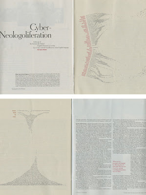
 Winston also uses a process of cutting out type to create depth of field. He writes, "Obviously, the piece is no longer about the actual words. Instead, I was implying that the space between words is where thoughts take shape."
I also noticed that among his list of solo shows is one at the Scuola Internazionale di Graphica in Venice, where three of the Crew members studied abroad together (sorry Colvin). I love that his work was shown at a school so focused on the art of bookmaking— very appropriate. ••••
Thursday, June 19, 2008
Sam Winston
Subscribe to:
Post Comments (Atom)


2 comments:
HEART HIM!!!!
TESS! Awesome find. And it reminds me SOOOOO much of the self-portrait you did for your portfolio. Amazing. I love innovative typography.
And must you really bring up the fact that i didn't go to Italy with you guys. it still makes me sad.... can't we just pretend i was there?!
Post a Comment