Wednesday, December 14, 2011


Tuesday, October 11, 2011

Saturday, January 8, 2011
Fonts In Use
 Fonts In Use is an amazing reference website for type geeks. If you are interested in current type trends and reading other's opinions on type, this is the place for you. You can organize posts by type, industry or format. It's hard not being a millionaire because I can't buy every typeface I want, but this way I can at least make a well-informed list. The authors have a very sharp eye for kerning, you can't get anything past them! Didoni might be my new favorite. Samples below. ••••


Monday, November 8, 2010
Mashed Up Type


 Just doing a little online shopping and came across some sassy typography at Madewell. I know it is the cardinal rule to limit your type to 1 or 2 faces...but I love this mixed up treatment! ••••
Thursday, May 13, 2010

Tuesday, March 23, 2010
Meet Me @ the MoMA

When it comes to typographical characters I'd have to say the Ampersand is my favorite. (Yeah, you read that right. Some people have favorite athletes or celebrities...me? I follow, adore and respect typographical symbols. *scary*) So although I fancy the shape of the "&" symbol, the "@" symbol is one of the most widely used characters today. @ is an essential part to every email address, and unless you're still trying to avoid the social media craze, you identify people by their "handle" beginning with, yup, you guessed it, the @ symbol. (@CrewDesign. Follow us.) It seems the @ symbol is more than just a shift+2 these days, it has officially been deemed "art worthy" by being inducted into MoMA's permanent design collection. The New York Times published an interesting article, Why @ Is Held in Such High Regard, questioning the significance of this seemingly insignificant character and ultimately explained how the symbol became a valid contribution to the design world. ••••
Wednesday, March 17, 2010

Tuesday, June 30, 2009
The CREW's Summer Plans...


Boy Scouts go to camp. So do musicians, baseball players, and cheerleaders. So why should Graphic Designers be excluded? Fear not! There's a place for us too-- TYPE CAMP! Don't worry, it only brings an entirely new meaning to the word "designerd." Let your Type Freak Flag fly free! ••••
Tuesday, April 21, 2009
A Bird's Eye View on Typography
 One of those projects you just wish you thought to undertake yourself— Rhett Dashwood has scoured Google Maps and discovered the above letterforms in the landscape of Victoria, Australia. ••••
Wednesday, January 28, 2009
Sick of Helvetica Yet?
 I've come across quite a few "handmade" typefaces over the past few days, and have been saving them all up for one post! Above, my favorite: an eyelash typeface from Amitis Pahlevan, via Typograph Served. Below, some additional proof that you can make type out of pretty much anything.


From top to bottom: High Heel typeface by design student Zumra Waheed, via Uppercase Journal. Thread typeface via HandMadeFont. Two experiemental typefaces by a rather ambitious designer over at Type.fwis.com. Chris Papsadero is attempting to create a typeface a day for 31 days straight. They are available for download. The first is actually comprised of type boxes which you can fill with your own text. The second is based on Dutch Colonial Architecture. ••••
Wednesday, November 19, 2008
Letter Cult
 I am really into letters today. Letter Cult is a relatively new site obsessing over custom and original letterforms. I found the site through one of my faves, Jon Contino. Boasting interesting Q&As with great artists as well as a "Letterstream" of inspiration, this site is just what I needed today (I'm creating my own type...) and I am excited to follow it. ••••

Hand Made Font

An Estonia based "foundry" with typefaces that are all handmade. I'm not sure I would pay the price for them, but the concept is inspiring. Here.••••
Monday, October 13, 2008
Mad About Mad Men
 Thank you so much to Grain Edit for sending me to Mark Simonson's blog entry about the "typecasting" in Mad Men. I follow the show religiously and often admire the costumes, the sets and the 1960s aesthetic that characterizes the show. I thought that I paid attention to details, but Mark has taken it to an entirely different and complex level. In his blog post he examines the typefaces used throughout the show and their effectiveness and accuracy. It is a very fascinating viewpoint and will make me an even crazier fan of the hit AMC show. ••••
Friday, August 22, 2008
Hester Prynn, Trendsetter?
 Some of our more loyal readers may remember a post by Sarah back in our early days on this questionable Victor and Rolf design. It begs the question: what do you typophiles think about wearable your letterforms? Examples have been popping up left and right on the web, and I've pulled just a few of my favorites. Above, family tree necklace by Sarah Van Gameren, dictionary drop earrings from Foundling, and a vintage typewriter ring on Etsy.
  Upper and lowercase scarves from Little Factory.
 Letter tote bags from Bang, an Etsy necklace find, type tshirt from Veer, and an adorable, inexpensive J ring also from Etsy.

Friday, August 15, 2008
Photograms from A to Z
 Designers have a special power— the gift of seeing type everywhere, in everything. That's why I love this project by Dutch Osborne— a photogram alphabet, comprised entirely of found objects. Brilliant! ••••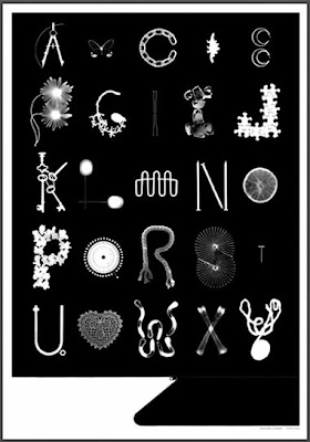
Sunday, August 10, 2008
Wall Type
 Recently, I've been searching for ways to incorporate type into my apartment decor. Ebay has always been a great source for inspiration, as you never quite know what treasure will pop up when you do a search for "letterpress" or "printer's block," for example. But I also came across this set of more "mass-produced" options— recycled metal letters at Urban Outfitters for eight bucks a pop (each one unique), and an Enamel Alphabet as well for twelve dollars each. Paper Source also has a series of inexpensive craft letter forms, which you could decorate to your own taste. I'm still on the lookout for more ideas, and it would be great to hear from Crew readers of other sources they might have! ••••
Monday, August 4, 2008
From the Mind of Stefan Sagmeister...
A few months ago now, Meghan B and I ventured out to the ICA in Boston to hear a lecture given by a Design Great— the one, the only Stefan Sagmeister. The website for his NYC based design firm Sagmeister, Inc. will give you some idea of his unique approach to design— he is perhaps best known for his album covers or the AIGA lecture poster in which he famously carved typography into his body with an X-acto knife (ouch).
This weekend, I finally read Sagmeister's most recent book, Things I Have Learned In My Life So Far, and it is something I would recommend to designers and non-designers alike. In his straightforward, honest tone, Stefan writes about his thoughts during a client-free year. Twenty of these musings were transformed into some of the most impressive typographic creations I have ever seen— videos, billboards, murals, mailers, etc. The topics he touches upon relate to the creative process and life in general. Below are two of the fantastic video pieces that resulted from the project.
Stefan has also launched thingsihavelearnedinmylife.com, where anyone can share their own typographic reflections. ••••
Tuesday, July 29, 2008
Fonts for Thought
 Futura, Franklin Gothic, Baskerville, Didot, Garamond, Century Gothic, Helvetica (despite my recent post), Trade Gothic, Rockwell, and Arial Narrow. ••••
Monday, July 21, 2008
Is It Just Me?

...or is the Helvetica obsession getting a little old? (or maybe I am having a case of the Mondays). Anyone?••••
Tuesday, July 15, 2008
Found Across the Globe: Mystic, Connecticut (with a short lesson on "nautical typography")
There is nothing like New England in the summer. My city of Boston comes to life after a very, very long winter and I remember again why it is I choose to live here. But one of the greatest advantages of the location is its proximity to so many amazing summer day trip destinations. The weekend comes and Bostonians flock to the Cape or the beaches of Rhode Island, and this past weekend I found myself in the lovely town of Mystic, Connecticut.
Mystic is a leading New England seaport with a history rooted in the whaling industry. It is also home to Mystic Seaport, a large maritime museum (Wikipedia refers to it as the world's largest, in fact) with some amazingly preserved ships. The museum is incredible, informative, and wonderfully kept up— and you'll see from the photos that the town is equally charming. Hand-painted signage, beach kitch, and bits of preserved history make Mystic well worth the visit. In addition to learning all about the whaling industry, shipbuilding, scrimshaw, figureheads, and Mystic Pizza, I was given a short lesson on the "nautical alphabet." Before my sister clued me in, I never knew the meaning behind these small flags which you often see displayed on boats or used in preppy patterning. These flags can be used in combinations, just as letters are, to spell out messages between two ships or between ship and shore. Used singly, these each have individual meanings— for instance, the letter L alone means "Stop Instantly." For a full lesson on "nautical typography," visit this helpful site. ••••




 Posts
Posts