I know we are all sick to death of talking about the recession (maybe this should have been an MJ post, but I already started writing...) HOWEVER— I couldn't resist sharing this really smart information graphic illustrating the Largest Bankruptcies in History, including all those that contributed to/resulted from the situation today. To summarize, Lehman Brothers:Titanic as Chrystler:Speedboat. Clever!
It was made by the Brooklyn creative team known as Always With Honor and featured in June's issue of GOOD magazine. I am really impressed ALL their work, but in particular with the flair they bring to information graphics. Just check out what the Obamas having growing in the White House lawn below. I have serious garden envy.
Showing posts with label portfolio. Show all posts
Showing posts with label portfolio. Show all posts
Tuesday, July 14, 2009
Going Under


Tuesday, June 30, 2009
Sarah Illenberger

I feel in love with Sarah Illenberger's portfolio today. I had to include more than a few example of her work in this post, but I highly recommend that you check out her portfolio...beautiful photography and editorial work. ••••


Thursday, June 19, 2008
Sam Winston
 I came across the work of Sam Winston via DesignBloom, where they featured a few photos of his folded dictionaries which simply blew me away. His work with typography and printed material is meticulous, innovative, and amazingly beautiful. Says Winston in his artist's statement: "I was always going to be a writer but it was when I discovered other alphabets— of colour shape and form— that's when things really began to get interesting."
 Above are Winston's folded dictionaries, and below are a few of his "Dictionary Story Prints." They remind me of type exercises I did back in design school, but wow does he take it to another level. He has also done similar pieces for the New York Times Magazine.
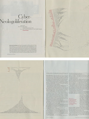
 Winston also uses a process of cutting out type to create depth of field. He writes, "Obviously, the piece is no longer about the actual words. Instead, I was implying that the space between words is where thoughts take shape."
I also noticed that among his list of solo shows is one at the Scuola Internazionale di Graphica in Venice, where three of the Crew members studied abroad together (sorry Colvin). I love that his work was shown at a school so focused on the art of bookmaking— very appropriate. ••••
Thursday, April 17, 2008
Building Your Portfolio Website: Six Things to Never Do
Great advice from Coroflot.com
1. Don't think you're a web designer unless you actually are: This is the Achilles heel of many creative professionals: the belief that being competent in one creative capacity qualifies you for another. The problem with building a site from scratch, unless you're already skilled at web design, is the powerful desire to do too much, and do it poorly. Few situations better merit the guideline "Less is more" than building your first portfolio site. (Personal Story: I used Creativehotlist.com to showcase my work, and that worked out great the past 2 years).
2. Don't think you're a Graphic designer unless you actually are: Some of you reading this are, in fact, graphic designers, and it's true that you'll be judged on the cleverness and innovation in your site's graphic layout. The rest aren't, so try designing one primary image at a time, accessed either through thumbnails or a slide show. "It's so direct, so quick...you can take in a lot of information and not feel overwhelmed."
3. Don't go nuts with the branding thing: If you have a personal logo, icon, catchphrase, or whatever, use it with restraint.It's a bit like seasoning a stew: a little spice can complement the ingredients, but too much will ruin them. (Personal story: I once interviewed a man who branded him self a little too much...he actually illustrated himself, and put that illustration on everything...website, portoflio, and resume. Enough is enough. Not to mention the illustration wasn't amazing, so it worked aganist him).
4. Don't write like a 12-year-old, or like a used car salesman: As ridiculous as it seems to repeat it: spell-check everything. Remember, too, that you're not creating an advertisement, so don't write advertising copy. You want to appeal to other designers most likely, and they're as wary of slick writing as you are. (Personal Story: Right out of school, I admit I had an old draft of my resume on my online portfolio. About 3 misspellings total. On my first interview EVER, they called me out on it. I was mortified).
5. Don't expect it to be perfect immediately: Websites are dynamic things, and viewers expect them to change. Moreover, if you're a working designer, you should be constantly posting new work, fine-tuning layouts, improving copy, adding links. (With this is mind, maybe keep the Flash animation to a minimal, unless you are an expert, for two reasons, #1 9 times out of 10, some action script element is not working, and then that's the only thing people will notice. #2 A lot of people do not have Flash plug ins downloaded, and nothings worse than a big ole error on the screen.)
6. Don't re-invent the wheel: The bright side of all of these warnings is that they're nothing new. Smart, talented people have been building websites for a long time now, and have figured out some elegant ways of making just the sort of site you want. (Actually, I am not sure if I agree with this point by Coroflot).
Read the complete article here.
Subscribe to:
Posts (Atom)




 Posts
Posts