 This month's issue of HOW featured a guerrilla advertising campaign by the Salvation Army that really impressed me with its intelligence. The Salvation Army had a low budget for advertising. No budget, really. According to HOW, "83 cents from every dollar donated to the Salvation Army goes to the people it serves."
 Enter the VIA group, who came up with a brilliant concept they could execute without draining the SA's resources. The campaign messages, "This ad cost nothing" or "We cut our advertising budget in whole" (to name just two) appeared everywhere from a dirty car window to underneath the lid of your pizza box. Such a clever way to increase visibility without draining funds! ••••
Tuesday, October 27, 2009
Low Budget, High Design
Wednesday, June 24, 2009
Boom Boom
 A creepy/great new campaign from the Zurich Chamber Orchestra about the way music can make you feel. I don't like to think I have a percussionist in my heart, but that would make sense. This is a really smart idea. Via Fubiz. ••••

Monday, April 27, 2009
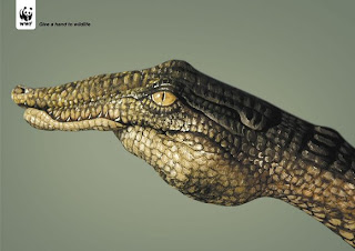
Give a Hand to Wildlife


I love this recent WWF "Give a Hand to Wildlife" campaign created by Saatchi and Saatchi Simko. Creative director Olivier Girard, worked with body painter Guido Daniele to create these powerful and clever print ads. ••••
Tuesday, October 14, 2008
Turn the Heat Up


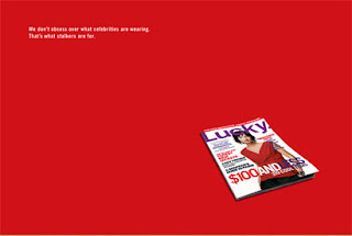
 I recently came across the work produced by Heat, a full-service ad agency in San Francisco. Small in size, but big in quality this agency creates well designed and witty advertising campaigns for print, tv, and web. Specifically, I want to focus on the series of advertisements for a number of leading magazines. The print ads seen here are for Lucky, Jane, Domino, and Cargo Magazine. Although they are for different magazines I feel that they all reflect the Heat style of using simplicity, strong typography, and witty taglines. Each advertisement is memorable and helps to build each particular brand. ••••
 Take a look at the Heat website for more examples of their impressive work.
Tuesday, September 30, 2008
Stop and Shop? Is that you?
 I want to know what everyone thinks about this change. A couple of weeks ago I noticed some exceptionally snazzy commercials for Stop and Shop. Semicircles flailing around, creating shapes of items that I indeed want to purchase at a low price (fruit) and things I like (smiling faces?). To me, this is a logo for an overpriced boutique fruit stand where a pear can probably run about $3.00. I don't like it. The colorway belongs at DisneyWorld. Get it out of here. My bitterness also stems from my affinity for the old logo. I think they could have gone a million different ways working with the red and green circles and the stoplight story. Sure the type is a little clumsy, but that is totally fixable! What I really want to know is, what do you think? ••••

Thursday, August 21, 2008
Sony Subway

Interesting and well executed new Sony ad created by Saatchi & Saatchi Sydney. The agency took Sony's earphones and literally mapped out the New York subway system, mimicking a traditional subway map. ••••
Monday, July 21, 2008
DIGO Brands
Ok, so perhaps I've just been watching too much Mad Men (which next to blogging is my new favorite pastime), but lately I've been captivated by strong advertising campaigns. The work of New York advertising and branding agency DIGO has been my recent obsession. Working to build brands as fast and effectively as possible these "brand advocates" have developed multiple campaigns that represent advertising at it's finest: simple, straight-forward, repetitive and memorable. Here are a couple of my favorites:
The Plaza Hotel - based on the notion that travelers think of The Plaza Hotel as "a dream" rather than just a hotel, or a place to sleep a series of print ads were created. Drawing on the history of the Plaza Hotel and the rich, decadent connotations surrounding it beautiful photography paired with simple taglines help to reinforce the Plaza Hotel brand. (Check out their website to enlarge the images for full representation) 

 I also love this clever idea uniting Crunch Fitness and JetBlue airlines - The two companies appear to have nothing in common - one being a gym and the other being an airline. However, DIGO was able to use both recognizable brands and unite them in a very interesting way. Again using a simple premise - flying is stressful and exercising relieves stress - they placed Crunch punching bags in airport terminals with a simple message reminding the already stressed out passenger why they might need to let out some steam. They also created airplane yoga cards which are humorous and helpful. ••••

Thursday, May 22, 2008
Mind the Quote
 Great campaign to "Get London Reading" by KentLyons, a design agency based out of (where else?) London. The passage below was found in multiple spots along Brick Lane. The concept is simple and, I think, very effective— a well written sentence drops off the page and right onto the path you tread everyday. What better way to remind people to take time out from their busy schedules for a good book? The Get London Reading website shows its visitors where books are found around the city, offers a list of literary events, and even has a "Rough Guide to London by the Book," which is basically a tour of the city through its writings. I would love to see a campaign like this hit the US! ••••
Tuesday, April 29, 2008
We/Me Campaign Logo

By now I'm sure everyone has seen the new We/Me promotional campaign developed by Al Gore and team in connection with the Alliance for Climate Protection. Designer Brian Collins created this effective and powerful logo to lead the campaign and to help spread awareness to the growing "green" movement. The logo sums up the ultimate initiative that each person must work individually to help the climate crisis; however, WE must work together in order to make a difference. Click here for an insightful article from the New York Times describing the effectiveness of the logo. ••••


