 Ok, I know this post is similar to my bad library book post, but it's funny...and it's Monday. Found via copyranter. ••••
Monday, December 14, 2009
What Is Funky?!
Tuesday, September 22, 2009
What if?
Today, I saw a beautiful (but sad) commercial for the South African investment firm Allen Gray. The concept: James Dean lives a long and prosperous live. The tagline: Given more time, imagine the possibilities.
Monday, April 27, 2009
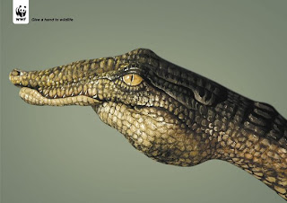
Give a Hand to Wildlife


I love this recent WWF "Give a Hand to Wildlife" campaign created by Saatchi and Saatchi Simko. Creative director Olivier Girard, worked with body painter Guido Daniele to create these powerful and clever print ads. ••••
Wednesday, March 25, 2009
It's Wednesday... Namaste!
 Happy Wednesday to all my fellow LOST fans. One of my favorite blogs, Grain Edit posted these great vintage Dharma advertisements this morning, and I couldn't resist sharing them. Made by designer Adam Campbell— click here to see all six. ••••

Friday, January 9, 2009
Legal Graffiti

I have a sick sharpie obsession. It is down right dangerous and obsessive. There are easily 60-70 sharpies on my desk at work, not to mention the other 100 or so at home. I love this new interactive ad campaign being launched in a number of cities.
"The creative minds working for Sharpie, the ultimate in permanent markers, have discovered a way to satiate our desires to deface public domain. Interactive e-cast billboards have been scattered around cities, which allow people to experience the rush of creating their own graffiti. Choose some colors, write a message and Sharpie makes it possible for anyone to leave his permanent mark on the side of the bus stop or the public phone or anywhere else billboard adverting may be experienced." -via thecoolhunter ••••
Wednesday, November 19, 2008
Become a designer and quit your boring job!
 Do you love the draw?! Do you love computers?! Do you loathe the recent onslaught of 'Become a Graphic Designer Today!" commericals as much as I do?! Jessica Helfand from the The Design Observer has written a brilliant article about these very ads that, in my opinion, trivialize the profession and education of design. ••••
Tuesday, October 14, 2008
Turn the Heat Up


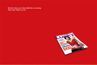
 I recently came across the work produced by Heat, a full-service ad agency in San Francisco. Small in size, but big in quality this agency creates well designed and witty advertising campaigns for print, tv, and web. Specifically, I want to focus on the series of advertisements for a number of leading magazines. The print ads seen here are for Lucky, Jane, Domino, and Cargo Magazine. Although they are for different magazines I feel that they all reflect the Heat style of using simplicity, strong typography, and witty taglines. Each advertisement is memorable and helps to build each particular brand. ••••
 Take a look at the Heat website for more examples of their impressive work.
Monday, September 22, 2008
MAC: 12,629,003 PC:1
Thursday, September 11, 2008
Yada Yada Yada
I'm always curious to see what Microsoft is doing to combat Apple's gradual takeover of their market. And then the other day, I saw this commercial. And its bad... really bad. I loved Seinfeld as much as the next girl— maybe more than the next girl. But for me, the jokes fall flat (Clothes in the shower? Cake computers?) and don't make me want to try Vista in the least. Reportedly, Jerry was paid 10 million to endorse Microsoft, although a Mac appeared on his desk for eight seasons of Seinfeld.
Thursday, August 28, 2008
Wind Is "In"
 According to the New York Times., The wind turbine is the “it” item of summer 2008. This recognition comes as no surprise to me, a designer that uses turbine imagery daily in her work. To everyone else, it's impossible to not notice the repeating image of wind turbines hitting all media, especially the presidential campaigns.
"Not since Don Quixote have so many windmills presented such an orgy of illusion: wind power accounts for only about 1 percent of the nation’s energy. But that’s the way it is with a cultural icon: it is both of and ahead of its time, and it knows that looking good is half the battle."
“What makes this such a powerful icon is that it’s unbelievably simple and telegraphic,” said Allen P. Adamson, managing director of the New York office of Landor Associates, a corporate branding firm, and “and yet it’s a serious idea. It has transcended its literal functionality to become an iconic symbol of the ideal.” ••••
Monday, July 21, 2008
DIGO Brands
Ok, so perhaps I've just been watching too much Mad Men (which next to blogging is my new favorite pastime), but lately I've been captivated by strong advertising campaigns. The work of New York advertising and branding agency DIGO has been my recent obsession. Working to build brands as fast and effectively as possible these "brand advocates" have developed multiple campaigns that represent advertising at it's finest: simple, straight-forward, repetitive and memorable. Here are a couple of my favorites:
The Plaza Hotel - based on the notion that travelers think of The Plaza Hotel as "a dream" rather than just a hotel, or a place to sleep a series of print ads were created. Drawing on the history of the Plaza Hotel and the rich, decadent connotations surrounding it beautiful photography paired with simple taglines help to reinforce the Plaza Hotel brand. (Check out their website to enlarge the images for full representation) 

 I also love this clever idea uniting Crunch Fitness and JetBlue airlines - The two companies appear to have nothing in common - one being a gym and the other being an airline. However, DIGO was able to use both recognizable brands and unite them in a very interesting way. Again using a simple premise - flying is stressful and exercising relieves stress - they placed Crunch punching bags in airport terminals with a simple message reminding the already stressed out passenger why they might need to let out some steam. They also created airplane yoga cards which are humorous and helpful. ••••

Tuesday, July 15, 2008
Clever Campaign
I came across this clever campaign by the ad agency Lowe Worldwide for laundry detergent. Simple and effective, the box contains a sample of the detergent and is brilliantly wrapped in a plain white t-shirt. When sent through the mail, the shirt inevitably gets dirty, thus the laundry detergent sample is ready to be tested out. Rarely is a direct mailer this well thought out and able to incorporate every element from product to packaging to express the message of the campaign. ••••


Tuesday, May 27, 2008
Wednesday, May 7, 2008
Vintage is the new modern


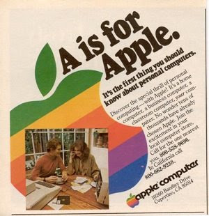
The website Worth1000 recently organized a contest asking contestants to take modern products and display them in vintage style advertisements. The final products are quite clever and humorous. ••••
Sunday, May 4, 2008
Prince Spaghetti Day in The North End of Boston
This old TV ad cracks me up, and its a nice shout out to Boston. ••••
Thursday, April 24, 2008
Step Right Up and win a Commissioned Painting!
 Absent-mindedly flipping through Vogue magazine, I came across an interesting ad campaign by Mastercard. A very small white envelope was attached to a blank page. It was sealed with a mock wax seal, and contained a small note card informing me that I had not won the price of a unique commissioned Julian Schnabel portrait. I hadn't won, but I was still very impressed with both the available prize and the (expensive) Marketing campaign.
As it turns out, Mastercard is giving away a few "priceless" awards: the portrait, a one-week, multi continent culinary experience with a chef, and an elaborate trip abroad. The cooking and the trip are pretty typical, but I love that a commissioned portrait is a prize. I don't think since the 18th century has a painting been such a noted prize, and I can't see why not.
By the way, Julian Schnabel is an American artist, born in Brooklyn in 1951, but now lives in Texas. He was first recognized as major painting force after his first solo show at the Mary Boone Gallery in 1979. In the 1980s, he had become a major figure in the Neo-expressionism movement. He is now famous for "plate paintings"—large-scale paintings set on broken ceramic plates. ••••
Monday, April 14, 2008
My kind of commute
 IKEA, in a stroke of advertising genius, has transformed a train in Kobe, Japan to a glorified Ikea showroom. Sofas, curtains, and wall paint have been added in an exciting, eye catching way. Unfortunately, this isn't a trend that's going to stay...the decor will be removed after the newest IKEA opening in Port Island. I wonder who assembled the furniture for the train...
 via Gizmodo
Friday, April 4, 2008
How do you like your sports advertisements?

 With less than three weeks to go, Boston is in the grips of Marathon Fever yet again— and the advertisements throughout the city prove it. I'm not running the marathon, but I do love distance running at this time of year, mainly because the weather is gorgeous and the yearly Adidas poster campaign keeps me motivated every time I go past an inspirational billboard. Unfortunately, my camera was out of battery when I tried to take a photo in the Copley subway station this morning, but these ads from previous years give you the idea: every one has an image and a corresponding "Reason to Run" scribbled upon a marathon bib. Somewhat generic format? Maybe... but I need to say, it is still one of my favorite running campaigns. The best I saw today read: "The crowd screams louder than my legs."
 Now, on the flip side you have last year's Reebok running campaign. The tag line, "Run Easy," took a very different approach, and I'm just going to come out and say it: I hated it. Design wise, maybe the distressed type was more interesting than the Adidas approach, but I don't think it is a smart move for any serious sports company to take this route. The middle ad above specifically targets Nike's "Just Do It" tag, beloved by runners everywhere. Does Reebok really want to set themselves apart by being the choice for the non-competitive athlete? I'm not particularly fast or competitive, but even I was turned off by this! However, I know many people liked the ads, and I can see why— not everyone wants to kill themselves for a sport, and this is more welcoming to the casual athlete. But at the same time there is something amazing about what competitive marathoners do that certainly wins my respect, and I don't like seeing Reebok downplay that. How do you feel about this semi-controversial campaign?
Thursday, April 3, 2008
Anuncios Antiguos Mexicanos

Americans vintage ads are a dime a dozen; they are reproduced everywhere from restaurant decor to dorm room posters. Its so refreshing to see vintage advertisements from Mexico circa 1950s and 1960s. Mexicovers1.blogspot.com is a blog devoted to these treasures.
Tuesday, April 1, 2008
Gmail Genius
All four of us are already Gmail users, but even if I wasn't this video would be enough to convert me. Created by designer Saatchi Moscow to get more Russian patronage, this is a fun and totally original way to illustrate the user interface.


