
 On Nov. 4, most ballots will repeat design mistakes made in previous elections. Many of these errors are avoidable. This year, the United States Election Assistance Commission released ballot design guidelines. Using these guidelines, AIGA developed a new interactive feature, on the New York Times online, to identify common design problems and offer improvements.
Click Here to see an example of the problem ballot in 2004 and the new design solutions. ••••
Thursday, August 28, 2008
How Design Can Save Democracy
Spiele: Otl Aicher's Olympic Graphic Design

 The Olympics might be over, but Olympic design will always live on. Guest Curator Joe Miller will be exhibiting his collection of graphic design from the 1972 Olympic Games at San Jose State University from August 26 through September 26. To be honest, I don't know much about graphic designer Otl Aicher (i must have been asleep that day in the History of Graphic Design), but from the brief bio on the website he sounds like a very influential and important contributor to 20th century graphic design -- worth a trip to the exhibit, i'm sure! Thank you Grain Edit for bringing this to our attention. ••••
Wind Is "In"
 According to the New York Times., The wind turbine is the “it” item of summer 2008. This recognition comes as no surprise to me, a designer that uses turbine imagery daily in her work. To everyone else, it's impossible to not notice the repeating image of wind turbines hitting all media, especially the presidential campaigns.
"Not since Don Quixote have so many windmills presented such an orgy of illusion: wind power accounts for only about 1 percent of the nation’s energy. But that’s the way it is with a cultural icon: it is both of and ahead of its time, and it knows that looking good is half the battle."
“What makes this such a powerful icon is that it’s unbelievably simple and telegraphic,” said Allen P. Adamson, managing director of the New York office of Landor Associates, a corporate branding firm, and “and yet it’s a serious idea. It has transcended its literal functionality to become an iconic symbol of the ideal.” ••••
Tuesday, August 26, 2008
A nice way...to keep people out

The Dutch Design House, Demakersvan has created the Lace Fence.
Beautiful execution of using a harsh material to create an intricate, lovely piece of art. ••••"Industrial production is for us a big source of inspiration. The Big Miracle of
how some products come about is a beautiful phenomenon if you look at it
closely. In our projects we often combine the sensitive and the small with the
powerful, large and industrial. The Lace Fence project translates that line of
thinking".


Monday, August 25, 2008
Matt Stuart


 It's true what they say: Creative people see the world differently than average people. Photographer Matt Stuart represents this idea more effectively than almost anyone I have seen. Known for his street photography, Stuart captures average people or scenes on the streets of London that might go unnoticed by the average person. Stuart's vast collection of photos exemplifies the humor and wit in everyday city life. I'm not sure how he manages to capture such remarkable small moments in time - the patience of a saint, no doubt - but in doing so Stuart proves that his vision of the world is fresh and inventive. Lucky for us he's captured this on film. ••••
Across the Univers
 To all my Crew members out there here's a little throw back to Graphic Design 101 (Does Josef Albers come to mind to anyone?). And to all you graphic designers out there here's something to wear to show your superiority in the graphic design community. Wait, superiority might not be the right word...let's be honest and go with supreme nerdiness. Regardless, what designer wouldn't appreciate using type as a fashion statement? You can buy your own shirt here. ••••
Friday, August 22, 2008
Hester Prynn, Trendsetter?
 Some of our more loyal readers may remember a post by Sarah back in our early days on this questionable Victor and Rolf design. It begs the question: what do you typophiles think about wearable your letterforms? Examples have been popping up left and right on the web, and I've pulled just a few of my favorites. Above, family tree necklace by Sarah Van Gameren, dictionary drop earrings from Foundling, and a vintage typewriter ring on Etsy.
  Upper and lowercase scarves from Little Factory.
 Letter tote bags from Bang, an Etsy necklace find, type tshirt from Veer, and an adorable, inexpensive J ring also from Etsy.

Laverne pulled the look off, so why shouldn't we? In fact, Miu Miu used Laverne's trademark initial L as inspiration for their fall show. ••••
Thursday, August 21, 2008
Sony Subway

Interesting and well executed new Sony ad created by Saatchi & Saatchi Sydney. The agency took Sony's earphones and literally mapped out the New York subway system, mimicking a traditional subway map. ••••
Wednesday, August 20, 2008
True is True
 I often flip through art and design books when I'm feeling uninspired. To my surprise and delight, I just found the online equivalent. Trueistrue.com is a website unlike any other. With each click the screen fills up with a single image - not unlike flipping through a coffee table book. In fact, it reminds me a lot of my favorite design book The Art of Looking Sideways by Alan Fletcher; an experience more like flipping through an artist's sketchbook full of quotes and seemingly random imagery. That, or it's a website full of subliminal messages and I'm actually being brainwashed...yikes! ••••
Copy Cat?
 The city of Chandler, Arizona is out ragged; Barack Obama has stolen their city's logo! Both logos are round with a white circle in the middle and red and white lines distinguishing a perspective point. A round red, white, and blue logo?! Call me crazy, but the concept of this design was not invented by the city of Chandler.
Resident Michael Rivera says, "I know this sounds like a petty issue, but if our city has that logo trademarked we should be at least charging Senator Obama a licensing fee." An attorney for Chandler's mayor has said that it isn't likely Chandler will make any demands of Obama (despite the logo being trademarked in 1993).
The debate over the originality of a logo design is not a new topic for designers. Multiple corporations and businesses have been in legal battles for years over the design and trademark of their logo, but lets face it-no matter how clever your idea, the chances are someone has created a very similar logo. The reasons for these copy cats is no coincidence. We’re all surrounded by the same influences, exposed to the same shapes, forms and patterns. Logos follow certain trends in the marketing place and designers take note of these changes. And lets not forget the old saying 'Imitation is the best form of flattery.'
Below are some the most famous and controversial logo copy cat examples. 


Via Logodesignlove.com and azcentral.com ••••
Monday, August 18, 2008
Small Doses of Inspiration
 I've been putting a lot of thought recently into designing my personal business card, and while searching the web for inspiration the other day I hit the jackpot. Daily poetics has a flickr set consisting of 874 very well-designed cards (and counting). The set features many types and styles of cards, ranging from those that are clever (but sometimes gimmicky), elegant, amusing, or even downright funny. This is just a sampling of a few of my personal favorites, but if you have some time to kill, you won't regret browsing the set in its entirety to choose your own. ••••


Bus Stops
Every morning I wait by a metal poll with the number 48 on it for my bus. Not exactly glamorous. However, it seems that some lucky folks get to wait for public transportation in absolute creativity and luxury. Check out these fun bus stops found on Trend Insights. ••••


Friday, August 15, 2008
Photograms from A to Z
 Designers have a special power— the gift of seeing type everywhere, in everything. That's why I love this project by Dutch Osborne— a photogram alphabet, comprised entirely of found objects. Brilliant! ••••
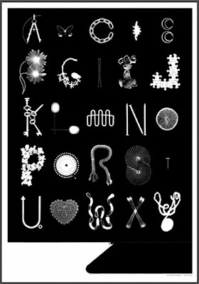
Thursday, August 14, 2008
Pop Art Defined
When given the task to design a poster that celebrates and defines Pop Art one would likely take a very literal approach and create something full of color and graphic imagery associated with the movement. Fortunately, Graphic Thought Facility chose a simple, typographical and black and white solution. What defines Pop Art? See below: ••••
••••
Wednesday, August 13, 2008

Five Franklin Place

 I know Martin will eventually make her way to the Big Apple and normally I'd be hesitant to join her, however, I could be persuaded with a residence at Five Franklin Place. Unfortunately, unless this little blog endeavor finds a way to make us millionaires I highly doubt this dream will ever come true. In the meantime, I'll just admire the architectural wonder. Located in New York's TriBeCa district this new building is truly magnificent. Dutch architect Ben van Berkel of UNStudio was able to blend his contemporary design with the surrounding historical architecture in a seamless, effective way.
  Equally as impressive in design is the marketing website and video presentation designed by Flat Design. The strong branding that has supported this architectural achievement has made Five Franklin Place one of New York's most famous contemporary residences. ••••
Olympic Graffiti
 For those of you who haven't noticed, Crew Design has Olympic Fever. We just can't get enough of the design, the sports, the glory... and even the controversies. From that poor little buck-toothed girl who wasn't "cute enough" to sing the national anthem, to the debate raging on over the ages of the winning Chinese women's gymnastics team, this summer Olympics has had no shortage of scandal. But the more serious and politically charged controversies have been playing out in an arena other than the media: street art around the globe.
 Print magazine and the Guardian both had interesting online articles about the Olympic-inspired graffiti (both pro and con) being made around the world. Beijing has created a 200-foot long mural, referred to as the Olympic Culture Wall, as a state-endorsed celebration of the games. The wall, perhaps the longest piece of graffiti ever made, is covered in images of the cuddly Fuwa, caricatures of athletes, traditional Chinese masks, "Love China" hearts, and more. The mural has been embraced by locals, but the Western media is somewhat perturbed by the amount of government supervision that presided over its creation, calling it a "propaganda" piece.
 The Chinese Communist party typically keeps a tight reign on this type of public expression, and even the seemingly harmless Fuwa have an underlying political charge (one of them is a Tibetan antelope). In pieces created by graffiti artists opposed to the games being held in Beijing, discussion centers around China's control over TIbet (and its inclusion as a scheduled stop along the torch relay route), freedom of speech for the press, and the rights of the Chinese people in general. The graffiti works above are found in Prague and Milan (respectively) and the work below was created in London by the renowned British street artist Banksy. ••••
Tuesday, August 12, 2008
Seven


Personally, I'm not much of a "skater"...however, this just might turn me. Seven is an exhibition of skateboard decks that have been artistically carved with a laser. A select group of 50 artists were chosen to put their own artistic touch on a the seven layers of ply that make up a deck. The final product is gorgeous. As are the amazing images of the detailed laser work. ••••
Olympic Stadium Design
 The Olympics are full of greatness-great athletes, great events, and even great design. Awhile back I wrote about the design of the official Beijing Olympic logo proving that art and design are as important to the games as the games themselves. Equally as grand and impressive are the architectural achievements that are resurrected in preparation for the ceremonies. The most impressive building built for this year's Olympic Games has to be the stadium at the center of it all. Nicknamed the Bird's Nest this monstrous structure can hold over 90,000 spectators - as witnessed at the Opening Ceremonies on August 8. The New York times recently wrote a piece on the design of the stadium:
"Expect to be overwhelmed. Designed by the Swiss architects Jacques Herzog and Pierre de Meuron, the stadium lives up to its aspiration as a global landmark. Its elliptical latticework shell, which has earned it the nickname the Bird’s Nest, has an intoxicating beauty that lingers in the imagination. Its allure is only likely to deepen once the enormous crowds disperse and the Olympic Games fade into memory." ••••

Monday, August 11, 2008
Blue Art Studio

 I'm in love with these posters from Blue Art Studio. Amazing use of solid color and graphic shapes to create depth and space. The color palette and retro appeal make for a beautiful complete collection. ••••

Subscribe to:
Posts (Atom)


